You’ve worked hard to purchase your vacation rental home, but, once you own a second house, you may realize that buying it was the easy part.
The care and maintenance of a second home that also functions like a small business isn’t easy, so you really want the home itself to do as much of the work for you as possible.
Where is the best ROI in upgrades? Marketing.
The advent of digital photography, the Internet, and rental websites make getting your home in front of a large audience simple and effective. Once you’ve got it out there in front of people, though, you’ve got to make it stand out. So a quick makeover before you get those photos up will really maximize your return on that investment.
The good news is that you can make some big changes without taking on an entire remodel. We’ve got six budget friendly makeovers that will add real value to your vacation rental and your marketing efforts.
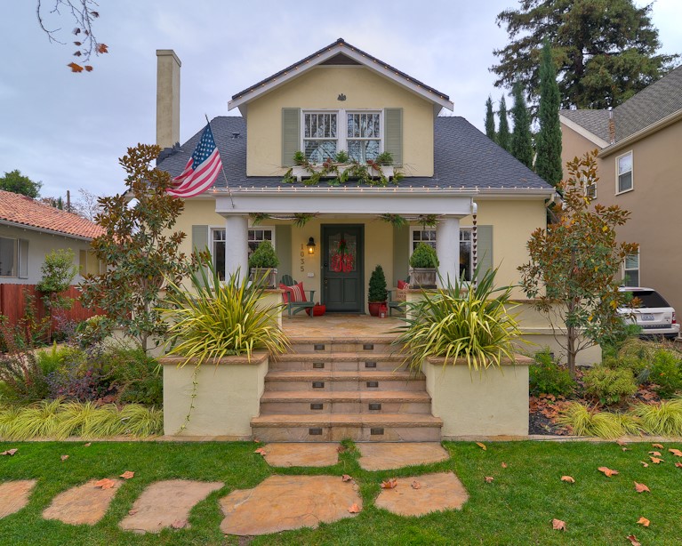
Add Architectural Detail: It doesn’t take much to add some visual interest to your rental. Adding window trim, door casings and exterior shutters are step one. If you’ve already got those elements, plan a makeover with a weekend paint job. Next, add custom railings to the porch and patio. Because a vacation home can bear just a little more accessorizing than most homes, consider finishing it off with adorable, old-school awnings. Also, see Susan Hutchins’ post, 15 Tips for Adding Curb Appeal.
Play with Paint: A fresh coat of color is the easy first choice for upgrading your property. We mention it second because that new architectural detail you’ve added requires a careful approach where paint is concerned. In order to highlight the new trimmings, pick two to three colors of complementary but contrasting shades. We have our clients start by choosing colors on opposite ends of a paint strip for trim and body paint. Once you get the sense of it, you can venture to different paint strips to find the perfect combo. Make sure to experiment with a few pints of paint to see the colors next to each other and what they look like at different times of the day.
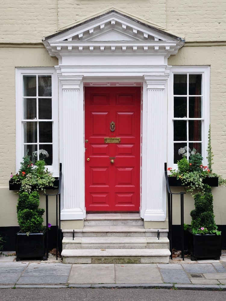
Make it Pop: Put the cherry on top with a colorful coat of paint for the front door. This is the most welcoming feature you can add. Here again, you’re looking for a color that contrasts and complements at the same time, only you can be a little more brave with the front door. A few rules of thumb: Black brings a timeless elegance and works best with exteriors of a lighter color. Red is popular because it contrasts well with light or dark homes. I always tell clients to choose a red that is a shade or two darker in tone than your first instinct. Citrusy colors such as lime green, lemon yellow and tangerine work well with darker homes and add a sense of whimsy that might just be perfect for a vacation getaway.
Go Green: Choose low maintenance plants that are native to the area your tenants have come to visit. Select crawlers and shrubbery in tones that complement the exterior of the home and that evoke the tranquility that helps your guests decompress. Save the pops of color for the entry path and some flower boxes to add more architectural interest in a more organic way. Even if the front yard isn’t fenced, consider an arbor at the entrance to the property to tell your guests they’re entering a very special place.
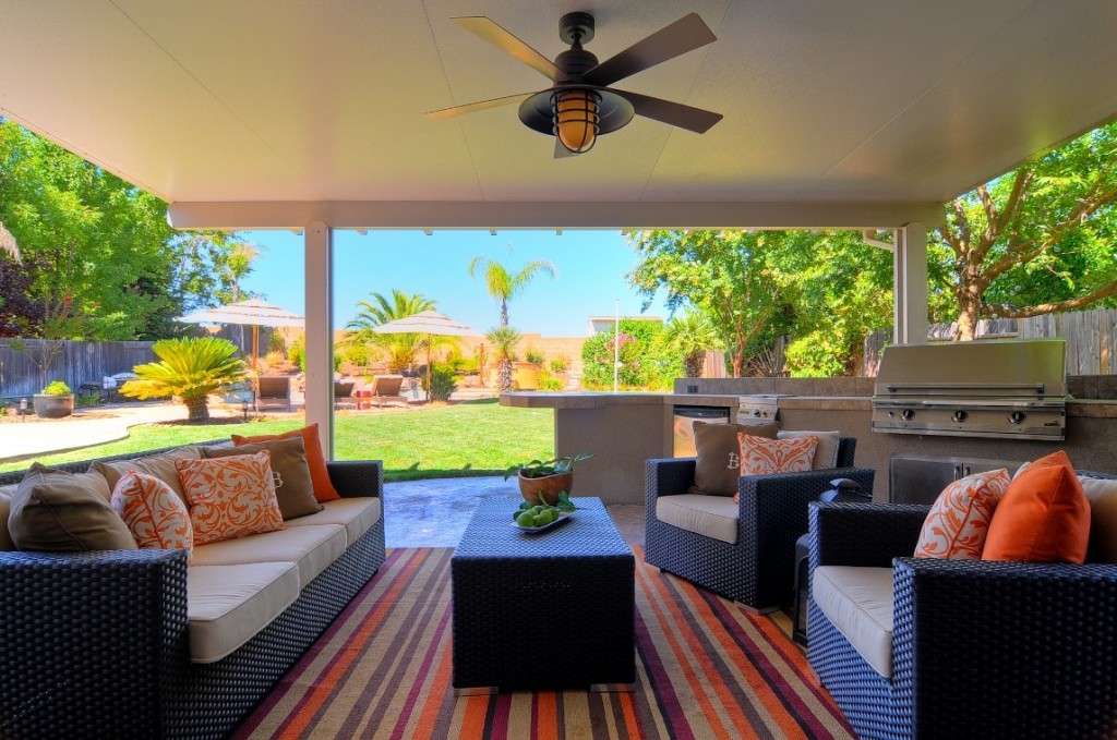
Move the Inside Out: Add some extra square footage to your rental by upgrading the outdoor furniture. The plastic chairs and glass top table will feel more like a resort if you bring in rich and sturdy wood and comfortable chairs with a little padding instead. Then replace those chaise lounges with an outdoor sectional and chairs with a few more padded pops of color. Finish off your new outdoor living room with a firepit, and your guests won’t want to head back inside even in the dead of winter. Read more about the value of outdoor living spaces in Susan Hutchins’ post Decking out your Deck.
Get Funky: Finally, make your rental stand out with a great piece of outdoor art that will become the signature piece of your home that your guests and all the tourists in town remember. Anything from a fountain to a piece of sculpture crafted by a local artist and made of natural, native materials. If that’s just too much for the budget, check with local galleries and artists about a possible consignment deal: You display the art in a prominent place in exchange for clear signage and contact information for the artist.
We love working with vacation rentals because the whole point of a home away from home is to relax and have a little fun. What are some of your favorite features in vacation rentals where you’ve stayed?
Interior designer Kerrie Kelly provides first-class home design tips, including advice on doors and windows, for Home Depot. Kerrie is the author of Home Decor: A Sunset Design Guide. Her spruce-up advice for vacation properties is the result of many years’ experience working with owners. A collection of doors available at Home Depot is available online at http://www.homedepot.com/b/Doors-Windows-Doors/N-5yc1vZas82.


Great Article! Travellers need a great place to stay. They need to feel at home. In my case, I prefer spending more money on a nice looking vacation home.